Photo Analysis
0 Comments
Photo Analysis
Check out my presentation on Russian Constructivist Photography. Very interesting!
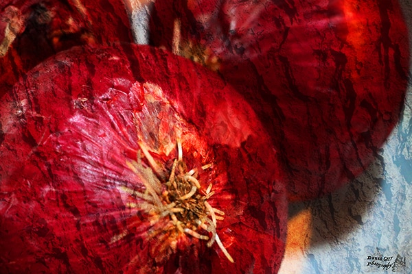
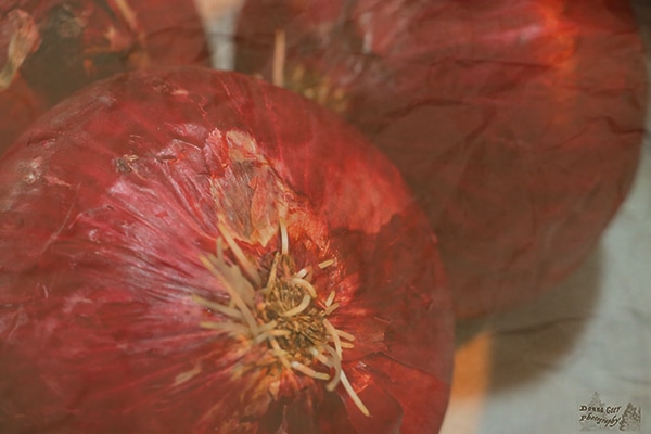
Black and White          Soft Focus    GradientSepia Tones    Using Grayscale Image Map with Dodge and Burn tools      Photo Analysis
      Photo Analysis
 Photo Analysis
White Balance - OutdoorsWhite Balance - IndoorsThe photographer's photo I have chosen to discuss is from the National Geographic Magazine from Oct 2013 and it's called North Korea. The photographer is David Guttenfelder. See attached link to photo and article. Let's take a walk through six aspects of what makes a photo good and see how we'd rate this one.
1 - What generally satisfies: The buildings on either side of the photo and the street down between them take you to the back of the photo, almost like you're walking down the street. There's a lot of white space in the lower third of the picture, which draws the eye to the single figure off center of the frame. The photo is laid out very well and is interesting to look at. 2 - Stimulates and provokes: It surely does. When I look at the photo, it makes me want to see more. I would love to see more of the people in that land. 3 - Is multi-layered: Yes. The photo speaks from a cultural and a political perspective. 4 - Fits the cultural context: Totally! With everything going on in North Korea, the photo seems to represent the isolation of the country - the picture seems isolated too since you only see one person and a small number of cars. 5 - Contains an idea: Of course. To me, it says the country is isolated and proudly so. It also says it's modern and will keep the decorum of someone directing traffic, even though there doesn't appear to be enough cars to warrant having a traffic officer in the intersection. 6 - Is true to the medium: Yes. The photograph itself is rather simple and the fact it's in black and white fits what I believe the photographer was trying to illustrate. |
|||||